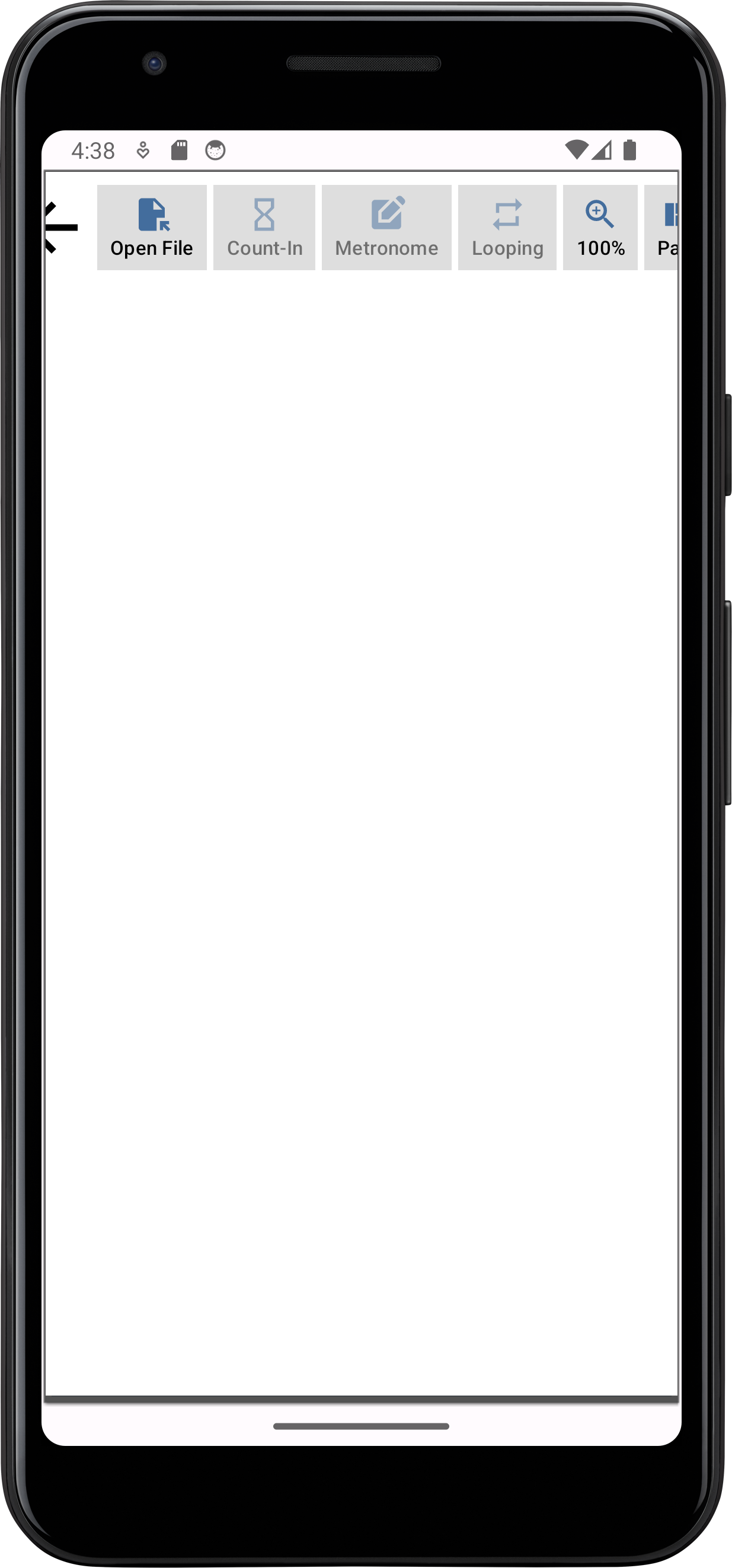
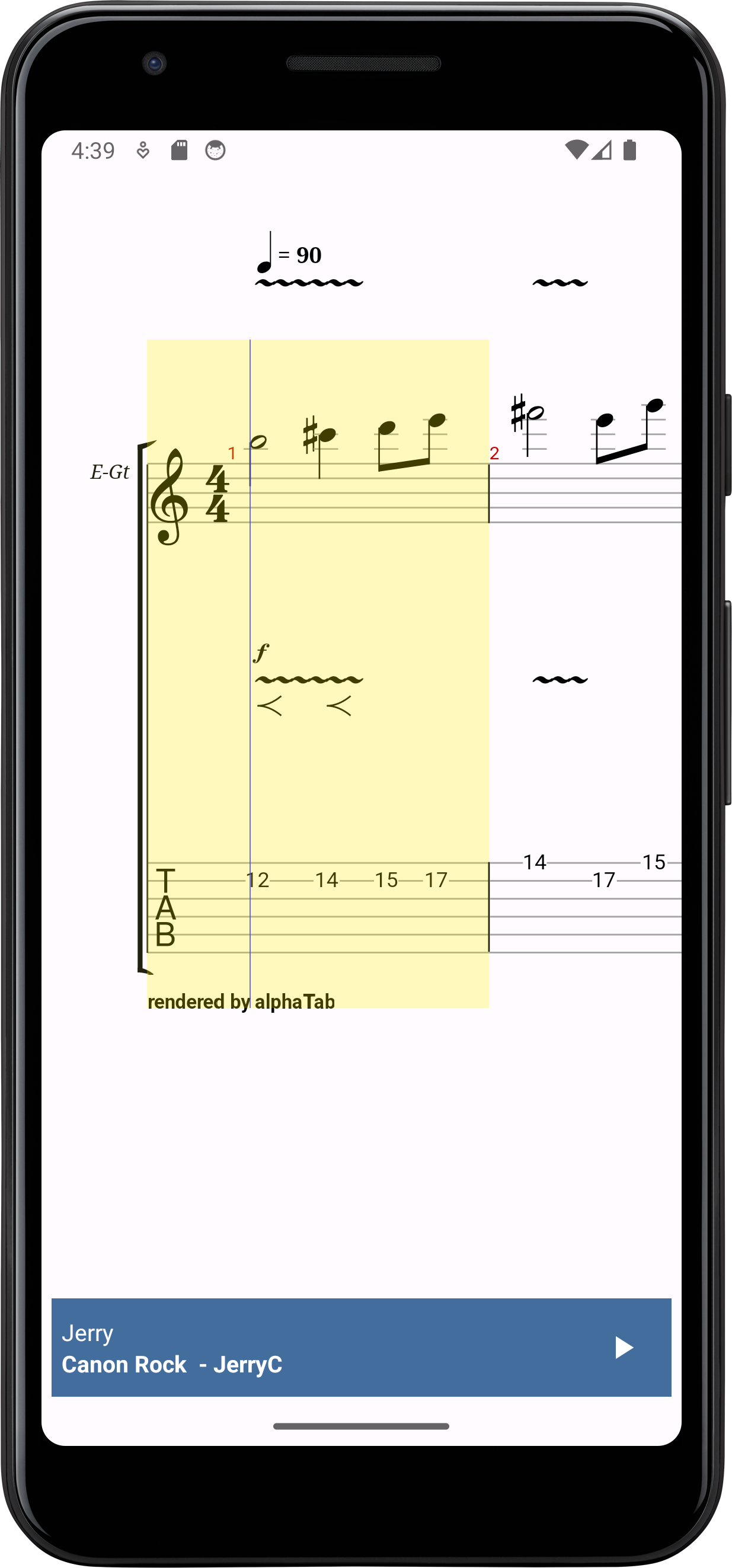
More Controls
In the following steps of the tutorial we will add some basic controls for the end users which will allow them to:
- Enable/Disable the count-in
- Enable/Disable the metronome
- Enable/Disable the looping
- Change the zoom level
- Change the layout of the music sheet
The implementation will follow the same principle for all controls:
- We add the UI to the popup
- We add new properties to the viewmodel.
- We add event listeners to the UI and interact with the viewmodel.
- In the activity we listen to the viewmodel values and map them to the alphaTab API object
Toggle Control Style
For the toggle controls we will add a small helper which will change the colors of the icon and text according to the check state. This code should not act as a reference how to properly style controls in android but is rather a simplistic approach for this tutorial.
- res/values/colors.xml
- ControlsPopupWindow.kt
In this file we add some new colors for our buttons which will toggle some features in an on/off fashion.
<color name="checkedIconColor">#FF436d9d</color>
<color name="uncheckedIconColor">#7F436d9d</color>
<color name="checkedTextColor">#FF000000</color>
<color name="uncheckedTextColor">#7F000000</color>
This helper takes care of handling the toggle button initializations and coloring.
private fun initToggle(
    button: MaterialButton,
    initialState: Boolean,
    onChange: (newValue: Boolean) -> Unit
) {
    updateToggleColors(button, initialState)
    button.addOnCheckedChangeListener { _, isChecked ->
        updateToggleColors(button, isChecked)
        onChange(isChecked)
    }
}

private fun updateToggleColors(buttonView: MaterialButton, isChecked: Boolean) {
    val textColor = if (isChecked) R.color.checkedTextColor else R.color.uncheckedTextColor
    val iconColor = if (isChecked) R.color.checkedIconColor else R.color.uncheckedIconColor

    val textColorList = ColorStateList.valueOf(ContextCompat.getColor(context, textColor))
    val iconColorList = ColorStateList.valueOf(ContextCompat.getColor(context, iconColor))

    buttonView.iconTint = iconColorList
    buttonView.setTextColor(textColorList)
}
Count-In
The count-in will become relevant when we activate the player in the next step, but we can already create the control which will set the count-in volume based on the toggle button state.
- popup_controls.xml
- MainViewModel.kt
- ControlsPopupWindow.kt
- MainActivity.kt
<!-- After openFile button -->
<com.google.android.material.button.MaterialButton
    android:id="@+id/countIn"
    style="@style/PopupButton"
    android:checkable="true"
    app:icon="@drawable/baseline_hourglass_empty_24"
    android:text="Count-In" />
class MainViewModel  : ViewModel() {
    ...
    val countIn = MutableLiveData(false)
}
init {
    ...

    initToggle(view.findViewById(R.id.countIn), mainViewModel.countIn.value ?: false) {
        mainViewModel.countIn.value = it
    }

    contentView = view
}
override fun onCreate(savedInstanceState: Bundle?) {
    ...
    mViewModel.countIn.observe(this) {
        mAlphaTabView.api.countInVolume = if (it) 1.0 else 0.0
    }
}
Metronome
The metronome will become relevant when we activate the player in the next step, but we can already create the control which will set the metronome volume based on the toggle button state.
- popup_controls.xml
- MainViewModel.kt
- ControlsPopupWindow.kt
- MainActivity.kt
<com.google.android.material.button.MaterialButton
    style="@style/PopupButton"
    android:checkable="true"
    android:id="@+id/metronome"
    app:icon="@drawable/baseline_edit_square_24"
    android:text="Metronome"/>
class MainViewModel  : ViewModel() {
    ...
    val metronome = MutableLiveData(false)
}
init {
    ...

    initToggle(view.findViewById(R.id.metronome), mainViewModel.metronome.value ?: false) {
        mainViewModel.metronome.value = it
    }

    contentView = view
}
override fun onCreate(savedInstanceState: Bundle?) {
    ...
    mViewModel.metronome.observe(this) {
        mAlphaTabView.api.metronomeVolume = if (it) 1.0 else 0.0
    }
}
Looping
Again nothing new here, rinse and repeat to extend the UI and map the UI state ultimately to the API object:
- popup_controls.xml
- MainViewModel.kt
- ControlsPopupWindow.kt
- MainActivity.kt
<com.google.android.material.button.MaterialButton
    style="@style/PopupButton"
    android:checkable="true"
    android:id="@+id/looping"
    app:icon="@drawable/baseline_repeat_24"
    android:text="Looping" />
class MainViewModel  : ViewModel() {
    ...
    val looping = MutableLiveData(false)
}
init {
    ...

    initToggle(view.findViewById(R.id.looping), mainViewModel.looping.value ?: false) {
        mainViewModel.looping.value = it
    }

    contentView = view
}
override fun onCreate(savedInstanceState: Bundle?) {
    ...
    mViewModel.looping.observe(this) {
        mAlphaTabView.api.isLooping = it
    }
}
Zoom
As alphaTab can change the scale in which the music sheet is rendered, we offer the user a popup menu to change this scale.
- res/menu/zoom.xml
- popup_controls.xml
- MainViewModel.kt
- ControlsPopupWindow.kt
- MainActivity.kt
<?xml version="1.0" encoding="utf-8"?>
<menu xmlns:tools="http://schemas.android.com/tools"
    xmlns:android="http://schemas.android.com/apk/res/android"
    tools:ignore="HardcodedText" >
    <item android:title="25%" />
    <item android:title="50%" />
    <item android:title="75%" />
    <item android:title="90%" />
    <item android:title="100%" />
    <item android:title="110%" />
    <item android:title="125%" />
    <item android:title="150%" />
    <item android:title="200%" />
</menu>
<com.google.android.material.button.MaterialButton
    style="@style/PopupButton"
    android:id="@+id/zoom"
    app:icon="@drawable/baseline_zoom_in_24"
    android:text="Zoom" />
class MainViewModel  : ViewModel() {
    ...
    val zoomLevel = MutableLiveData(100)
}
Here create a popup menu and inflate the pre-created menu items into it.
As we know we labeled all menu items with <percentage>% we can derive the zoom level from the label.
    init {
        ...

        val zoom = view.findViewById<MaterialButton>(R.id.zoom)
        @SuppressLint("SetTextI18n")
        zoom.text = "${mainViewModel.zoomLevel.value}%"
        zoom.setOnClickListener {
            PopupMenu(context, zoom).apply {
                setOnMenuItemClickListener {
                    val zoomLevel = it.title!!.trim('%').toString().toInt()
                    mainViewModel.zoomLevel.value = zoomLevel
                    this@ControlsPopupWindow.dismiss()
                    true
                }
                inflate(R.menu.zoom)
                show()

            }
        }

        contentView = view
    }
Updating the zoom level is a bit more effort than the previous tasks but still not very complicated:
First we fill the settings with the new scale. Then we tell alphaTab to read this updated settings
and re-render the music sheet.
    override fun onCreate(savedInstanceState: Bundle?) {
        ...
        mViewModel.zoomLevel.observe(this) {
            mAlphaTabView.settings.display.scale = it / 100.0
            mAlphaTabView.api.updateSettings()
            mAlphaTabView.renderTracks()
        }
    }
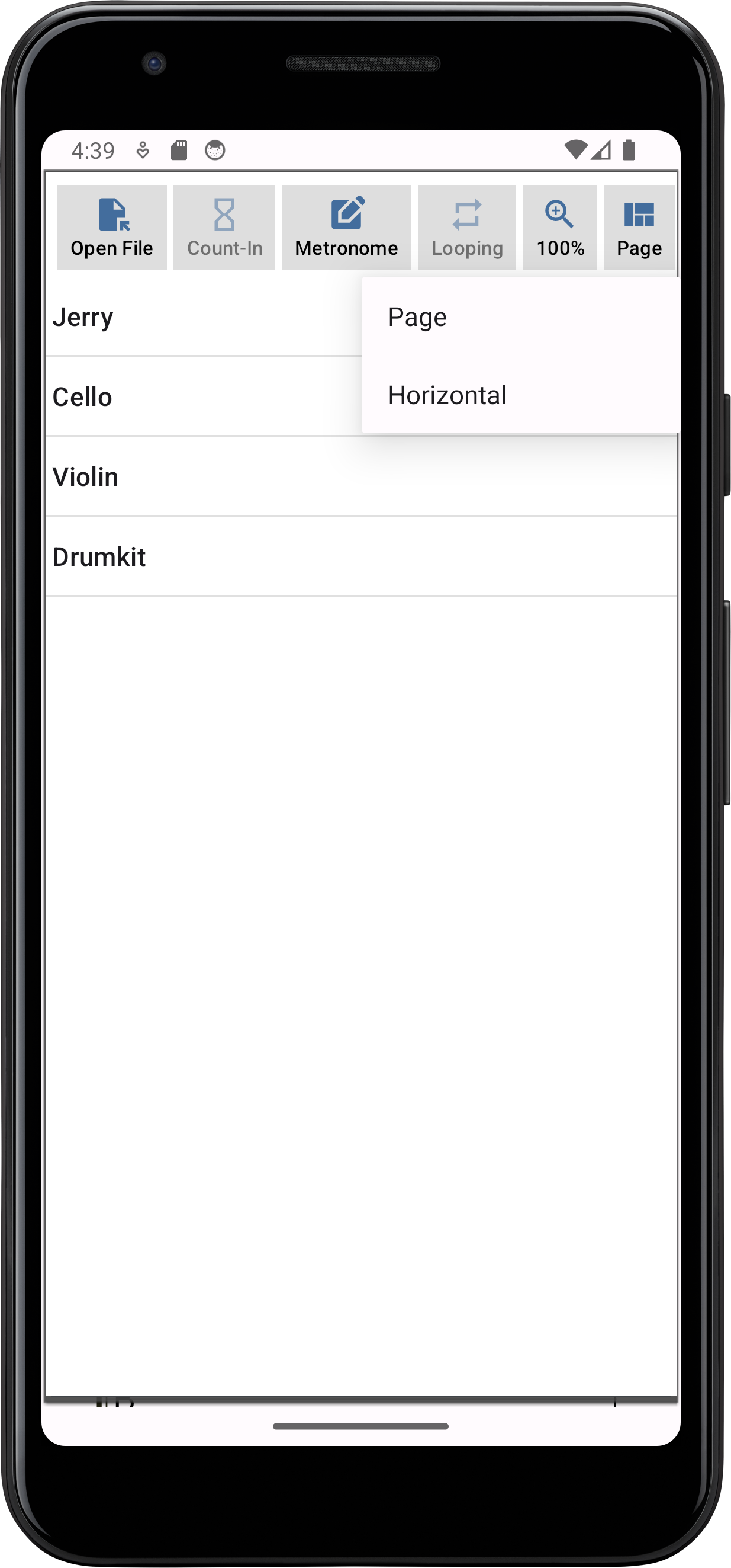
Layout
alphaTab can either render the music sheet in a page-like fashion that grows from top to bottom along the available width. Or it can show the music sheet in a horizontal scrolling fashion.
These options are also offered to the user via another popup menu. To actually apply the user selection we will again just fill the user input into the settings object and trigger an update just like for the zoom level:
- res/menu/layout.xml
- popup_controls.xml
- MainViewModel.kt
- ControlsPopupWindow.kt
- MainActivity.kt
<?xml version="1.0" encoding="utf-8"?>
<menu xmlns:tools="http://schemas.android.com/tools"
    xmlns:android="http://schemas.android.com/apk/res/android"
    tools:ignore="HardcodedText">
    <item android:title="Page" />
    <item android:title="Horizontal" />
</menu>
<com.google.android.material.button.MaterialButton
    style="@style/PopupButton"
    android:id="@+id/layout"
    app:icon="@drawable/baseline_view_quilt_24"
    android:text="Layout" />
import alphaTab.LayoutMode
...
class MainViewModel  : ViewModel() {
    ...
    val layout = MutableLiveData(LayoutMode.Page)
}
Similar to the zoom level we use the PopupMenu and inflate the menu from the resource into it. To get the right alphaTab layout mode we match again against the labels.
    init {
        ...

        val layout = view.findViewById<MaterialButton>(R.id.layout)
        @SuppressLint("SetTextI18n")
        layout.text = "${mainViewModel.layout.value!!.name}"
        layout.setOnClickListener {
            PopupMenu(context, layout).apply {
                setOnMenuItemClickListener {
                    mainViewModel.layout.value = when(it.title) {
                        "Page" -> LayoutMode.Page
                        "Horizontal" -> LayoutMode.Horizontal
                        else -> throw IllegalStateException("Unknown Layout")
                    }
                    this@ControlsPopupWindow.dismiss()
                    true
                }
                inflate(R.menu.layout)
                show()
            }
        }

        contentView = view
    }
Changing the layout is again similar to the zoom level. Changing the setting, refreshing the settings state inside alphaTab and trigger a render.
    override fun onCreate(savedInstanceState: Bundle?) {
        ...
        mViewModel.layout.observe(this) {
            mAlphaTabView.settings.display.layoutMode = it
            mAlphaTabView.api.updateSettings()
            mAlphaTabView.renderTracks()
        }
    }
Result
That was already it. As you can see now, it is typically the same task over and over to extend your app with new functionalities. The biggest complexity is to identify how you want to build your UI towards your user. Using your Android development expertise you give the user options to change the settings as desired. After that is "only" understanding how to tell alphaTab how to respect those settings. Often the idea for new features start in the Settings and API reference to see what functionalities are offered.
Final Files
- res/layout/activity_main.xml
- res/layout/popup_controls.xml
- res/menu/layout.xml
- res/menu/zoom.xml
- res/values/colors.xml
- res/values/themes/themes.xml
- MainActivity.kt
- MainViewModel.kt
- ControlsPopupWindow.kt
<?xml version="1.0" encoding="utf-8"?>
<androidx.constraintlayout.widget.ConstraintLayout xmlns:android="http://schemas.android.com/apk/res/android"
    xmlns:app="http://schemas.android.com/apk/res-auto"
    xmlns:tools="http://schemas.android.com/tools"
    android:id="@+id/main"
    android:layout_width="match_parent"
    android:layout_height="match_parent"
    tools:ignore="HardcodedText"
    tools:context=".MainActivity">

    <alphaTab.AlphaTabView
        android:id="@+id/alphatab"
        android:layout_width="match_parent"
        android:layout_height="match_parent"
        app:layout_constraintBottom_toBottomOf="parent"
        app:layout_constraintEnd_toEndOf="parent"
        app:layout_constraintStart_toStartOf="parent"
        app:layout_constraintTop_toTopOf="parent" />

    <RelativeLayout
        android:layout_width="match_parent"
        android:layout_height="wrap_content"
        android:layout_margin="6dp"
        android:padding="6dp"
        android:background="#436d9d"
        app:layout_constraintBottom_toBottomOf="parent"
        app:layout_constraintEnd_toEndOf="parent"
        app:layout_constraintStart_toStartOf="parent">

        <LinearLayout
            android:id="@+id/info"
            android:layout_width="wrap_content"
            android:layout_height="wrap_content"
            android:layout_alignParentStart="true"
            android:layout_centerVertical="true"
            android:layout_toStartOf="@+id/controls"
            android:orientation="vertical"
            >
            <TextView
                android:id="@+id/trackName"
                android:layout_width="wrap_content"
                android:layout_height="wrap_content"
                android:text="Track Name"
                android:textColor="@color/white" />
            <TextView
                android:id="@+id/songName"
                android:layout_width="wrap_content"
                android:layout_height="wrap_content"
                android:text="Song Name - Artist Name"
                android:textStyle="bold"
                android:textColor="@color/white"
                />

        </LinearLayout>

        <LinearLayout
            android:id="@+id/controls"
            android:layout_alignParentEnd="true"
            android:layout_width="wrap_content"
            android:layout_height="wrap_content">

            <ImageButton
                android:id="@+id/playPause"
                android:layout_width="48dp"
                android:layout_height="48dp"
                android:background="@null"
                android:textColor="@color/white"
                android:paddingHorizontal="7dp"
                android:contentDescription="Play/Pause"
                android:src="@drawable/baseline_play_arrow_24" />

        </LinearLayout>

    </RelativeLayout>

</androidx.constraintlayout.widget.ConstraintLayout>
<?xml version="1.0" encoding="utf-8"?>
<RelativeLayout xmlns:android="http://schemas.android.com/apk/res/android"
    xmlns:tools="http://schemas.android.com/tools"
    xmlns:app="http://schemas.android.com/apk/res-auto"
    tools:ignore="HardcodedText"
    android:layout_width="match_parent"
    android:layout_height="match_parent">

    <HorizontalScrollView
        android:id="@+id/buttons"
        android:layout_width="match_parent"
        android:background="@color/design_default_color_background"
        android:layout_alignParentStart="true"
        android:layout_height="wrap_content">

        <LinearLayout
            android:layout_width="wrap_content"
            android:layout_height="wrap_content"
            android:orientation="horizontal"
            android:layout_gravity="center_vertical"
            android:padding="4dp">

            <com.google.android.material.button.MaterialButton
                android:id="@+id/back"
                style="@style/PopupButton"
                app:icon="@drawable/baseline_arrow_back_48"
                app:iconSize="48dp"
                app:iconGravity="textStart"
                app:iconTint="@color/black"
                android:layout_marginHorizontal="8dp"
                android:padding="0dp"
                app:backgroundTint="@android:color/transparent"
                />

            <com.google.android.material.button.MaterialButton
                android:id="@+id/openFile"
                style="@style/PopupButton"
                app:icon="@drawable/baseline_file_open_24"
                android:text="Open File" />

            <com.google.android.material.button.MaterialButton
                android:id="@+id/countIn"
                style="@style/PopupButton"
                android:checkable="true"
                app:icon="@drawable/baseline_hourglass_empty_24"
                android:text="Count-In" />

            <com.google.android.material.button.MaterialButton
                style="@style/PopupButton"
                android:checkable="true"
                android:id="@+id/metronome"
                app:icon="@drawable/baseline_edit_square_24"
                android:text="Metronome"/>

            <com.google.android.material.button.MaterialButton
                style="@style/PopupButton"
                android:checkable="true"
                android:id="@+id/looping"
                app:icon="@drawable/baseline_repeat_24"
                android:text="Looping" />

            <com.google.android.material.button.MaterialButton
                style="@style/PopupButton"
                android:id="@+id/zoom"
                app:icon="@drawable/baseline_zoom_in_24"
                android:text="Zoom" />

            <com.google.android.material.button.MaterialButton
                style="@style/PopupButton"
                android:id="@+id/layout"
                app:icon="@drawable/baseline_view_quilt_24"
                android:text="Layout" />

        </LinearLayout>
    </HorizontalScrollView>

    <ListView
        android:id="@+id/trackList"
        android:layout_width="match_parent"
        android:layout_height="match_parent"
        android:layout_below="@id/buttons"
        android:layout_alignParentStart="true"
        android:layout_alignParentBottom="true"
        android:layout_marginStart="-12dp"
        android:layout_marginTop="-4dp"
        android:layout_marginBottom="3dp"
        android:background="@color/design_default_color_background">

    </ListView>

</RelativeLayout>
<?xml version="1.0" encoding="utf-8"?>
<menu xmlns:tools="http://schemas.android.com/tools"
    xmlns:android="http://schemas.android.com/apk/res/android"
    tools:ignore="HardcodedText">
    <item android:title="Page" />
    <item android:title="Horizontal" />
</menu>
<?xml version="1.0" encoding="utf-8"?>
<menu xmlns:tools="http://schemas.android.com/tools"
    xmlns:android="http://schemas.android.com/apk/res/android"
    tools:ignore="HardcodedText" >
    <item android:title="25%" />
    <item android:title="50%" />
    <item android:title="75%" />
    <item android:title="90%" />
    <item android:title="100%" />
    <item android:title="110%" />
    <item android:title="125%" />
    <item android:title="150%" />
    <item android:title="200%" />
</menu>
<?xml version="1.0" encoding="utf-8"?>
<resources>
    <color name="black">#FF000000</color>
    <color name="white">#FFFFFFFF</color>
    <color name="checkedIconColor">#FF436d9d</color>
    <color name="uncheckedIconColor">#7F436d9d</color>
    <color name="checkedTextColor">#FF000000</color>
    <color name="uncheckedTextColor">#7F000000</color>
</resources>
<resources xmlns:tools="http://schemas.android.com/tools"
    xmlns:app="http://schemas.android.com/apk/res-auto"
    >
    <!-- Base application theme. -->
    <style name="Base.Theme.AlphaTabTutorial" parent="Theme.Material3.DayNight.NoActionBar">
        <!-- Customize your light theme here. -->
        <!-- <item name="colorPrimary">@color/my_light_primary</item> -->
    </style>
    <style name="Theme.AlphaTabTutorial" parent="Base.Theme.AlphaTabTutorial" />

    <style name="PopupButton" parent="Widget.Material3.Button">
        <item name="iconPadding">0dp</item>
        <item name="cornerRadius">0dp</item>
        <item name="iconTint">#FF436d9d</item>
        <item name="iconGravity">top</item>
        <item name="iconSize">24dp</item>
        <item name="backgroundTint">#dedede</item>
        <item name="android:textSize">12sp</item>
        <item name="android:textColor">#000</item>
        <item name="android:layout_width">wrap_content</item>
        <item name="android:layout_height">wrap_content</item>
        <item name="android:layout_gravity">center_vertical</item>
        <item name="android:layout_marginEnd">4dp</item>
        <item name="android:minWidth">0dp</item>
        <item name="android:paddingHorizontal">8dp</item>
    </style>
</resources>
package net.alphatab.tutorial.android

import alphaTab.AlphaTabView
import alphaTab.core.ecmaScript.Uint8Array
import alphaTab.importer.ScoreLoader
import alphaTab.model.Score
import android.annotation.SuppressLint
import android.net.Uri
import android.os.Bundle
import android.util.Log
import android.view.Gravity
import android.view.View
import android.view.ViewGroup
import android.widget.TextView
import android.widget.Toast
import androidx.activity.enableEdgeToEdge
import androidx.activity.result.contract.ActivityResultContracts
import androidx.appcompat.app.AppCompatActivity
import androidx.core.view.ViewCompat
import androidx.core.view.WindowInsetsCompat
import androidx.lifecycle.ViewModelProvider
import java.io.ByteArrayOutputStream
import kotlin.contracts.ExperimentalContracts

@OptIn(ExperimentalContracts::class, ExperimentalUnsignedTypes::class)
@SuppressLint("SetTextI18n")
class MainActivity : AppCompatActivity() {

    private lateinit var mAlphaTabView: AlphaTabView
    private lateinit var mTrackName: TextView
    private lateinit var mSongName: TextView

    private lateinit var mViewModel: MainViewModel

    override fun onCreate(savedInstanceState: Bundle?) {
        super.onCreate(savedInstanceState)
        enableEdgeToEdge()
        setContentView(R.layout.activity_main)
        ViewCompat.setOnApplyWindowInsetsListener(findViewById(R.id.main)) { v, insets ->
            val systemBars = insets.getInsets(WindowInsetsCompat.Type.systemBars())
            v.setPadding(systemBars.left, systemBars.top, systemBars.right, systemBars.bottom)
            insets
        }

        mAlphaTabView = findViewById(R.id.alphatab)
        mTrackName = findViewById(R.id.trackName)
        mSongName = findViewById(R.id.songName)
        findViewById<View>(R.id.info).setOnClickListener {
            val popup = ControlsPopupWindow(
                this, mViewModel,
            ) {
                mOpenFile.launch(arrayOf("*/*"))
            }
            popup.width = ViewGroup.LayoutParams.MATCH_PARENT
            popup.height = ViewGroup.LayoutParams.MATCH_PARENT
            popup.showAtLocation(mAlphaTabView, Gravity.CENTER, 0, 0)
        }

        mViewModel = ViewModelProvider(this)[MainViewModel::class.java]
        mViewModel.settings.observe(this) {
            mAlphaTabView.settings = it
        }
        mViewModel.tracks.observe(this) {
            mAlphaTabView.tracks = it
            val first = it?.firstOrNull()
            if (first != null) {
                mTrackName.text = first.name
                mSongName.text = "${first.score.title} - ${first.score.artist}"
            }
        }
        mViewModel.countIn.observe(this) {
            mAlphaTabView.api.countInVolume = if (it) 1.0 else 0.0
        }
        mViewModel.metronome.observe(this) {
            mAlphaTabView.api.metronomeVolume = if (it) 1.0 else 0.0
        }
        mViewModel.looping.observe(this) {
            mAlphaTabView.api.isLooping = it
        }
        mViewModel.zoomLevel.observe(this) {
            mAlphaTabView.settings.display.scale = it / 100.0
            mAlphaTabView.api.updateSettings()
            mAlphaTabView.renderTracks()
        }
        mViewModel.layout.observe(this) {
            mAlphaTabView.settings.display.layoutMode = it
            mAlphaTabView.api.updateSettings()
            mAlphaTabView.renderTracks()
        }
    }

    private val mOpenFile = registerForActivityResult(ActivityResultContracts.OpenDocument()) {
        val uri = it ?: return@registerForActivityResult
        val score: Score
        try {
            val fileData = readFileData(uri)
            score = ScoreLoader.loadScoreFromBytes(fileData, mAlphaTabView.settings)
            Log.i("AlphaTab", "File loaded: ${score.title}")
        } catch (e: Exception) {
            Log.e("AlphaTab", "Failed to load file: $e, ${e.stackTraceToString()}")
            Toast.makeText(this, "Failed to load file: ${e.message}", Toast.LENGTH_LONG).show()
            return@registerForActivityResult
        }

        try {
            mViewModel.score.value = score
            mViewModel.tracks.value = arrayListOf(score.tracks[0])
        } catch (e: Exception) {
            Log.e("AlphaTab", "Failed to render file: $e, ${e.stackTraceToString()}")
            Toast.makeText(this, "Failed to render file: ${e.message}", Toast.LENGTH_LONG).show()
        }
    }

    private fun readFileData(uri: Uri): Uint8Array {
        val inputStream = contentResolver.openInputStream(uri)
        inputStream.use {
            ByteArrayOutputStream().use {
                inputStream!!.copyTo(it)
                return Uint8Array(it.toByteArray().asUByteArray())
            }
        }
    }
}
package net.alphatab.tutorial.android

import alphaTab.LayoutMode
import alphaTab.Settings
import alphaTab.model.Score
import alphaTab.model.Track
import androidx.lifecycle.MutableLiveData
import androidx.lifecycle.ViewModel
import kotlin.contracts.ExperimentalContracts

@ExperimentalUnsignedTypes
@ExperimentalContracts
class MainViewModel  : ViewModel() {
    val score = MutableLiveData<Score?>()
    val tracks = MutableLiveData<List<Track>?>()
    val countIn = MutableLiveData(false)
    val metronome = MutableLiveData(false)
    val looping = MutableLiveData(false)
    val zoomLevel = MutableLiveData(100)
    val layout = MutableLiveData(LayoutMode.Page)
    val settings = MutableLiveData<Settings>().apply {
        value = Settings().apply {
            this.player.enableCursor = true
            this.player.enablePlayer = true
            this.player.enableUserInteraction = true
            this.display.barCountPerPartial = 4.0
            this.display.resources.barNumberFont
        }
    }
}
package net.alphatab.tutorial.android

import alphaTab.LayoutMode
import alphaTab.model.Track
import android.annotation.SuppressLint
import android.content.Context
import android.content.res.ColorStateList
import android.view.LayoutInflater
import android.view.View
import android.view.ViewGroup
import android.widget.ArrayAdapter
import android.widget.ListView
import android.widget.PopupMenu
import android.widget.PopupWindow
import android.widget.TextView
import androidx.core.content.ContextCompat
import com.google.android.material.button.MaterialButton
import kotlin.contracts.ExperimentalContracts

@OptIn(ExperimentalContracts::class, ExperimentalUnsignedTypes::class)
@SuppressLint("InflateParams")
class ControlsPopupWindow(
    private val context: Context,
    private val mainViewModel: MainViewModel,
    onOpenFile: () -> Unit
) : PopupWindow(context) {
    private val mOpenButton: MaterialButton
    private val mTrackList: ListView

    init {
        val view = LayoutInflater.from(context).inflate(R.layout.popup_controls, null)

        mOpenButton = view.findViewById(R.id.openFile)
        mOpenButton.setOnClickListener {
            onOpenFile()
            dismiss()
        }

        mTrackList = view.findViewById(R.id.trackList)
        mTrackList.adapter =
            TrackListAdapter(context, mainViewModel.score.value?.tracks?.toList() ?: emptyList())
        mTrackList.setOnItemClickListener { _, _, position, _ ->
            mainViewModel.tracks.value =
                mutableListOf((mTrackList.adapter as TrackListAdapter).getItem(position)!!)
            dismiss()
        }

        view.findViewById<MaterialButton>(R.id.back).setOnClickListener {
            dismiss()
        }

        initToggle(view.findViewById(R.id.countIn), mainViewModel.countIn.value ?: false) {
            mainViewModel.countIn.value = it
        }

        initToggle(view.findViewById(R.id.metronome), mainViewModel.metronome.value ?: false) {
            mainViewModel.metronome.value = it
        }

        initToggle(view.findViewById(R.id.looping), mainViewModel.looping.value ?: false) {
            mainViewModel.looping.value = it
        }

        val zoom = view.findViewById<MaterialButton>(R.id.zoom)
        @SuppressLint("SetTextI18n")
        zoom.text = "${mainViewModel.zoomLevel.value}%"
        zoom.setOnClickListener {
            PopupMenu(context, zoom).apply {
                setOnMenuItemClickListener {
                    val zoomLevel = it.title!!.trim('%').toString().toInt()
                    mainViewModel.zoomLevel.value = zoomLevel
                    this@ControlsPopupWindow.dismiss()
                    true
                }
                inflate(R.menu.zoom)
                show()

            }
        }

        val layout = view.findViewById<MaterialButton>(R.id.layout)
        @SuppressLint("SetTextI18n")
        layout.text = "${mainViewModel.layout.value!!.name}"
        layout.setOnClickListener {
            PopupMenu(context, layout).apply {
                setOnMenuItemClickListener {
                    mainViewModel.layout.value = when(it.title) {
                        "Page" -> LayoutMode.Page
                        "Horizontal" -> LayoutMode.Horizontal
                        else -> throw IllegalStateException("Unknown Layout")
                    }
                    this@ControlsPopupWindow.dismiss()
                    true
                }
                inflate(R.menu.layout)
                show()
            }
        }

        contentView = view
    }

    private fun initToggle(
        button: MaterialButton,
        initialState: Boolean,
        onChange: (newValue: Boolean) -> Unit
    ) {
        updateToggleColors(button, initialState)
        button.addOnCheckedChangeListener { _, isChecked ->
            updateToggleColors(button, isChecked)
            onChange(isChecked)
        }
    }

    private fun updateToggleColors(buttonView: MaterialButton, isChecked: Boolean) {
        val textColor = if (isChecked) R.color.checkedTextColor else R.color.uncheckedTextColor
        val iconColor = if (isChecked) R.color.checkedIconColor else R.color.uncheckedIconColor

        val textColorList = ColorStateList.valueOf(ContextCompat.getColor(context, textColor))
        val iconColorList = ColorStateList.valueOf(ContextCompat.getColor(context, iconColor))

        buttonView.iconTint = iconColorList
        buttonView.setTextColor(textColorList)
    }


    class TrackListAdapter(context: Context, tracks: List<Track>) :
        ArrayAdapter<Track>(context, android.R.layout.simple_list_item_1, tracks) {

        private val mInflater: LayoutInflater = LayoutInflater.from(context)

        override fun getView(position: Int, convertView: View?, parent: ViewGroup): View {
            val view =
                convertView ?: mInflater.inflate(android.R.layout.simple_list_item_1, parent, false)

            if (view !is TextView) {
                throw IllegalStateException("Expected simple_list_item_1 to be a TextView")
            }

            val item = getItem(position)
            view.text = item!!.name
            return view
        }
    }
}