Player
Basic setup
Now as we have the basic component ready, it is time to add some sound. AlphaTab comes with an audio synthesis engine named AlphaSynth to play the songs via Midi and a SoundFont2 file.
To get the player configured is also quite easy as it is enabled by default in the main control.
alphaTab ships a free SoundFont2 file for usage on your website and it is already loaded by default.
You can choose to load a different one using the LoadSoundFont method.
We just need to add some UI elements for the user to start/pause the playback and show the current position.
Main player controls
Now we need to add the required controls for the users to play and pause the audio. We will add one button for play/pause which will change the icon depending on the current playback state. And we will also add one button which stops the playback and moves the cursor back to start.
We will use the PlayPause() and Stop() to send the right signals to alphaTab and we use the
PlayerStateChanged event to update the button icon. To ensure that the user does not interact with the player
before it is ready, we will keep the buttons disabled until the player is ready.
- New XAML
- New C#
We add the buttons right between the open button and the song info.
<Button Click="OnStopClicked" IsEnabled="{Binding IsPlayerReady}">
    <sharp:IconBlock Icon="StepBackward" />
</Button>
<Button Click="OnPlayPauseClicked" IsEnabled="{Binding IsPlayerReady}">
    <sharp:IconBlock x:Name="PlayPauseIcon" Icon="Play" />
</Button>
public bool IsPlayerReady => AlphaTab.Api?.IsReadyForPlayback ?? false;
private void OnStopClicked(object sender, RoutedEventArgs e)
{
    AlphaTab.Api.Stop();
}

private void OnPlayPauseClicked(object sender, RoutedEventArgs e)
{
    AlphaTab.Api.PlayPause();
}

private void OnAlphaTabLoaded(object sender, RoutedEventArgs e)
{
    AlphaTab.Api.PlayerStateChanged.On(pe =>
    {
        PlayPauseIcon.Icon = pe.State == PlayerState.Playing ? IconChar.Pause : IconChar.Play;
    });

    AlphaTab.Api.PlayerReady.On(() =>
    {
        OnPropertyChanged(nameof(IsPlayerReady));
    });
    ...
}
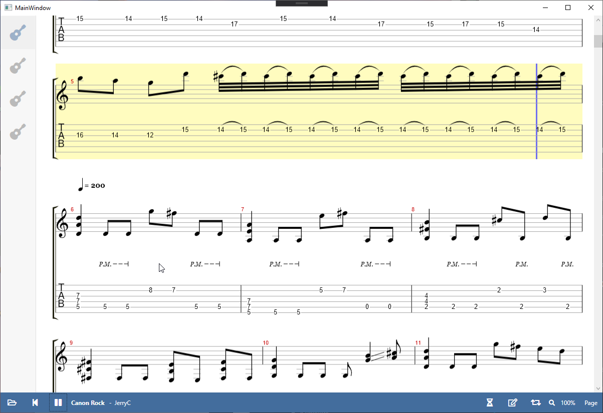
The result looks like this:
Showing the current time
In this step we will add a textual indicator the current position of the playback. You might use the provided information to also build a progress bar indicator for the users which could be even interactive with seeking. This tutorial will skip this part.
As in most other steps we will add some new XAML elements, corresponding properties and then
hook it up with some the alphaTab event PlayerPositionChanged fill the necessary data.
- New XAML
- New C#
We add the new TextBlocks after the song artist.
<TextBlock Text="{Binding CurrentTimePosition, StringFormat=mm\\:ss}" />
<TextBlock>/</TextBlock>
<TextBlock Text="{Binding TotalTimePosition, StringFormat=mm\\:ss}" />
private TimeSpan _currentTimePosition;
public TimeSpan CurrentTimePosition
{
    get => _currentTimePosition;
    set
    {
        if (value.Equals(_currentTimePosition)) return;
        _currentTimePosition = value;
        OnPropertyChanged();
    }
}

private TimeSpan _totalTimePosition;
public TimeSpan TotalTimePosition
{
    get => _totalTimePosition;
    set
    {
        if (value.Equals(_totalTimePosition)) return;
        _totalTimePosition = value;
        OnPropertyChanged();
    }
}
...
private void OnAlphaTabLoaded(object sender, RoutedEventArgs e)
{
    ...
    var previousTime = -1;
    AlphaTab.Api.PlayerPositionChanged.On(pe =>
    {
        var currentSeconds = (int)(pe.CurrentTime / 1000);
        if (currentSeconds == previousTime)
        {
            return;
        }
        previousTime = currentSeconds;

        CurrentTimePosition = TimeSpan.FromMilliseconds(pe.CurrentTime);
        TotalTimePosition = TimeSpan.FromMilliseconds(pe.EndTime);
    });
}
To reduce the number of UI updates we debounce the frequency to updates per second.
Final Files
- MainWindow.xaml
- MainWindow.xaml.cs
<Window
x:Class="AlphaTabTutorial.MainWindow"
xmlns="http://schemas.microsoft.com/winfx/2006/xaml/presentation"
xmlns:x="http://schemas.microsoft.com/winfx/2006/xaml"
xmlns:d="http://schemas.microsoft.com/expression/blend/2008"
xmlns:fa="http://schemas.awesome.incremented/wpf/xaml/fontawesome.sharp"
xmlns:local="clr-namespace:AlphaTabTutorial"
xmlns:mc="http://schemas.openxmlformats.org/markup-compatibility/2006"
xmlns:wpf="clr-namespace:AlphaTab.Wpf;assembly=AlphaTab.Windows"
Title="MainWindow"
Width="800"
Height="450"
d:DataContext="{d:DesignInstance local:MainWindow}"
mc:Ignorable="d">
<Grid>
<Grid.RowDefinitions>
<RowDefinition Height="*" />
<RowDefinition Height="Auto" />
</Grid.RowDefinitions>
<Canvas>
<Border
Canvas.Left="0"
Canvas.Top="0"
Width="{Binding RelativeSource={RelativeSource AncestorType=Canvas}, Path=ActualWidth}"
Height="{Binding RelativeSource={RelativeSource AncestorType=Canvas}, Path=ActualHeight}"
Padding="70,0,0,0">
<wpf:AlphaTab x:Name="AlphaTab" Loaded="OnAlphaTabLoaded" />
</Border>
<Border
Canvas.Left="0"
Canvas.Top="0"
Height="{Binding RelativeSource={RelativeSource AncestorType=Canvas}, Path=ActualHeight}"
MinWidth="70"
VerticalAlignment="Stretch"
Background="#f7f7f7"
BorderBrush="#1f000000"
BorderThickness="0,0,1,0"
ClipToBounds="False">
<Border.Resources>
<Style TargetType="ListBox">
<Setter Property="SelectionMode" Value="Single" />
<Setter Property="Background" Value="Transparent" />
<Setter Property="BorderThickness" Value="0" />
<Setter Property="Padding" Value="0" />
<Setter Property="MinWidth" Value="70" />
<Setter Property="ScrollViewer.HorizontalScrollBarVisibility" Value="Hidden" />
<Style.Triggers>
<Trigger Property="IsMouseOver" Value="False">
<Setter Property="MaxWidth" Value="70" />
</Trigger>
</Style.Triggers>
</Style>
<Style TargetType="ListBoxItem">
<Setter Property="Background" Value="Transparent" />
<Setter Property="BorderThickness" Value="0" />
<Setter Property="Margin" Value="0" />
<Style.Triggers>
<Trigger Property="IsSelected" Value="True">
<Setter Property="Background" Value="#08000000" />
<Setter Property="fa:IconBlock.Foreground" Value="#4972a1" />
<Setter Property="fa:IconBlock.Opacity" Value="1" />
</Trigger>
<Trigger Property="IsSelected" Value="False">
<Setter Property="fa:IconBlock.Opacity" Value="0.5" />
</Trigger>
<Trigger Property="IsMouseOver" Value="True">
<Setter Property="Background" Value="#1a000000" />
<Setter Property="fa:IconBlock.Opacity" Value="1" />
</Trigger>
</Style.Triggers>
</Style>
</Border.Resources>
<ListBox ItemsSource="{Binding Score.Tracks}" SelectedItem="{Binding SelectedTrack}">
<ListBox.ItemTemplate>
<ItemContainerTemplate DataType="model:Track">
<Grid Height="64">
<Grid.ColumnDefinitions>
<ColumnDefinition Width="64" />
<ColumnDefinition Width="*" />
</Grid.ColumnDefinitions>
<fa:IconBlock
Grid.Column="0"
Margin="0,0,5,0"
HorizontalAlignment="Center"
VerticalAlignment="Center"
FontSize="32px"
Icon="Guitar"
Opacity="0.5" />
<TextBlock
Grid.Column="1"
VerticalAlignment="Center"
FontWeight="Bold"
Text="{Binding Name}" />
</Grid>
</ItemContainerTemplate>
</ListBox.ItemTemplate>
</ListBox>
</Border>
</Canvas>
<Grid
Grid.Row="1"
Grid.Column="0"
Background="#436d9d">
<Grid.Resources>
<Style x:Key="ToolbarButtonBaseStyle" TargetType="ButtonBase">
<Setter Property="BorderThickness" Value="0" />
<Setter Property="Background" Value="Transparent" />
<Setter Property="Foreground" Value="White" />
<Setter Property="FontSize" Value="16px" />
<Setter Property="Padding" Value="4" />
<Setter Property="Margin" Value="3,0" />
<Setter Property="Width" Value="40" />
<Setter Property="Height" Value="40" />
<Setter Property="Cursor" Value="{x:Static Cursors.Hand}" />
<Setter Property="Template">
<Setter.Value>
<ControlTemplate TargetType="{x:Type ButtonBase}">
<Border
Name="Chrome"
Background="{TemplateBinding Background}"
BorderBrush="{TemplateBinding BorderBrush}"
SnapsToDevicePixels="true">
<ContentPresenter
Margin="{TemplateBinding Padding}"
HorizontalAlignment="{TemplateBinding HorizontalContentAlignment}"
VerticalAlignment="{TemplateBinding VerticalContentAlignment}"
RecognizesAccessKey="True"
SnapsToDevicePixels="{TemplateBinding SnapsToDevicePixels}" />
</Border>
</ControlTemplate>
</Setter.Value>
</Setter>
</Style>
<Style BasedOn="{StaticResource ToolbarButtonBaseStyle}" TargetType="Button" />
<Style BasedOn="{StaticResource ToolbarButtonBaseStyle}" TargetType="ToggleButton">
<Style.Triggers>
<Trigger Property="IsChecked" Value="True">
<Setter Property="Background" Value="#5588c7" />
</Trigger>
</Style.Triggers>
</Style>
<Style TargetType="TextBlock">
<Setter Property="Foreground" Value="White" />
<Setter Property="Margin" Value="3,0" />
<Setter Property="VerticalAlignment" Value="Center" />
</Style>
<Style TargetType="fa:IconBlock">
<Setter Property="Foreground" Value="White" />
<Setter Property="Margin" Value="3,0" />
<Setter Property="VerticalAlignment" Value="Center" />
</Style>
<Style TargetType="ComboBox">
<Setter Property="Background" Value="#436d9d" />
<Setter Property="Foreground" Value="White" />
<Setter Property="Template">
<Setter.Value>
<ControlTemplate TargetType="ComboBox">
<Grid>
<ToggleButton
Name="ToggleButton"
ClickMode="Press"
Focusable="False"
IsChecked="{Binding Path=IsDropDownOpen, RelativeSource={RelativeSource TemplatedParent}, Mode=TwoWay}">
<ToggleButton.Template>
<ControlTemplate TargetType="ToggleButton">
<Border Name="Border" Background="Transparent" />
<ControlTemplate.Triggers>
<Trigger Property="ToggleButton.IsChecked" Value="True">
<Setter TargetName="Border" Property="Background" Value="#5588c7" />
</Trigger>
</ControlTemplate.Triggers>
</ControlTemplate>
</ToggleButton.Template>
</ToggleButton>
<ContentPresenter
Name="ContentSite"
HorizontalAlignment="Center"
VerticalAlignment="Center"
Content="{TemplateBinding SelectionBoxItem}"
ContentTemplate="{TemplateBinding SelectionBoxItemTemplate}"
ContentTemplateSelector="{TemplateBinding ItemTemplateSelector}"
IsHitTestVisible="False" />
<TextBox
Name="PART_EditableTextBox"
Padding="{TemplateBinding Padding}"
HorizontalAlignment="Center"
VerticalAlignment="Center"
Background="Transparent"
Focusable="True"
IsReadOnly="{TemplateBinding IsReadOnly}"
Visibility="Hidden" />
<Popup
Name="Popup"
AllowsTransparency="True"
Focusable="False"
IsOpen="{TemplateBinding IsDropDownOpen}"
Placement="Top"
PopupAnimation="Slide">
<Grid
Name="DropDown"
MinWidth="{TemplateBinding ActualWidth}"
MaxHeight="{TemplateBinding MaxDropDownHeight}"
SnapsToDevicePixels="True">
<Border
Name="DropDownBorder"
Background="{TemplateBinding Background}"
CornerRadius="0" />
<ScrollViewer SnapsToDevicePixels="True">
<ItemsPresenter KeyboardNavigation.DirectionalNavigation="Contained" />
</ScrollViewer>
</Grid>
</Popup>
</Grid>
</ControlTemplate>
</Setter.Value>
</Setter>
</Style>
</Grid.Resources>
<Grid.ColumnDefinitions>
<ColumnDefinition Width="*" />
<ColumnDefinition Width="*" />
</Grid.ColumnDefinitions>
<StackPanel
Grid.Row="0"
Grid.Column="0"
Orientation="Horizontal">
<Button Click="OnOpenClick">
<fa:IconBlock Icon="FolderOpen" />
</Button>
<Button Click="OnStopClicked" IsEnabled="{Binding IsPlayerReady}">
<fa:IconBlock Icon="StepBackward" />
</Button>
<Button Click="OnPlayPauseClicked" IsEnabled="{Binding IsPlayerReady}">
<fa:IconBlock x:Name="PlayPauseIcon" Icon="Play" />
</Button>
<TextBlock FontWeight="Bold" Text="{Binding Score.Title}" />
<TextBlock>-</TextBlock>
<TextBlock Text="{Binding Score.Artist}" />
<TextBlock Text="{Binding CurrentTimePosition, StringFormat=mm\\:ss}" />
<TextBlock>/</TextBlock>
<TextBlock Text="{Binding TotalTimePosition, StringFormat=mm\\:ss}" />
</StackPanel>
<StackPanel
Grid.Row="0"
Grid.Column="1"
HorizontalAlignment="Right"
Orientation="Horizontal">
<ToggleButton IsChecked="{Binding IsCountInActive}">
<fa:IconBlock Icon="HourglassHalf" />
</ToggleButton>
<ToggleButton IsChecked="{Binding IsMetronomeActive}">
<fa:IconBlock Icon="Edit" />
</ToggleButton>
<ToggleButton IsChecked="{Binding IsLooping}">
<fa:IconBlock Icon="Retweet" />
</ToggleButton>
<fa:IconBlock Icon="Search" />
<ComboBox
ItemStringFormat="{}{0:P0}"
ItemsSource="{Binding ZoomLevels}"
SelectedItem="{Binding CurrentZoomLevel}" />
<ComboBox
ItemStringFormat="{}{0}"
ItemsSource="{Binding LayoutModes}"
SelectedItem="{Binding CurrentLayoutMode}" />
</StackPanel>
</Grid>
<Grid
Grid.Row="0"
Grid.RowSpan="2"
Visibility="{Binding LoadingIndicatorVisibility}">
<Border Background="#80000000" />
<Border
Margin="0,20,0,0"
Padding="10"
HorizontalAlignment="Center"
VerticalAlignment="Top"
Background="White">
<Border.Effect>
<DropShadowEffect
BlurRadius="10"
Direction="-90"
Opacity="0.3" />
</Border.Effect>
<TextBlock>
Music sheet is loading
</TextBlock>
</Border>
</Grid>
</Grid>
</Window>
using System;
using System.ComponentModel;
using System.IO;
using System.Runtime.CompilerServices;
using System.Windows;
using AlphaTab;
using AlphaTab.Importer;
using AlphaTab.Model;
using AlphaTab.Synth;
using FontAwesome.Sharp;
using Microsoft.Win32;

namespace AlphaTabTutorial
{
    public partial class MainWindow : INotifyPropertyChanged
    {
        private Score _score;
        private Track _selectedTrack;

        public Score Score
        {
            get => _score;
            set
            {
                if (Equals(value, _score)) return;
                _score = value;
                OnPropertyChanged();
                SelectedTrack = _score.Tracks[0];
            }
        }
        public Track SelectedTrack
        {
            get => _selectedTrack;
            set
            {
                if (Equals(value, _selectedTrack)) return;
                _selectedTrack = value;
                OnPropertyChanged();
                AlphaTab.Tracks = new[]
                {
                    value
                };
                AlphaTab.RenderTracks();
            }
        }

        private Visibility _loadingIndicatorVisibility = Visibility.Collapsed;
        public Visibility LoadingIndicatorVisibility
        {
            get => _loadingIndicatorVisibility;
            set
            {
                if (value == _loadingIndicatorVisibility) return;
                _loadingIndicatorVisibility = value;
                OnPropertyChanged();
            }
        }

        private bool _isCountInActive;
        public bool IsCountInActive
        {
            get => _isCountInActive;
            set
            {
                if (value == _isCountInActive) return;
                _isCountInActive = value;
                OnPropertyChanged();
                if (AlphaTab.Api != null)
                {
                    AlphaTab.Api.CountInVolume = value ? 1 : 0;
                }
            }
        }

        private bool _isMetronomeActive;
        public bool IsMetronomeActive
        {
            get => _isMetronomeActive;
            set
            {
                if (value == _isMetronomeActive) return;
                _isMetronomeActive = value;
                OnPropertyChanged();
                if (AlphaTab.Api != null)
                {
                    AlphaTab.Api.MetronomeVolume = value ? 1 : 0;
                }
            }
        }

        public double[] ZoomLevels { get; } =
        {
            0.25,
            0.5,
            0.75,
            0.9,
            1.0,
            1.1,
            1.25,
            1.5,
            2
        };

        private double _currentZoomLevel = 1.0;
        public double CurrentZoomLevel
        {
            get => _currentZoomLevel;
            set
            {
                if (value.Equals(_currentZoomLevel)) return;
                _currentZoomLevel = value;
                OnPropertyChanged();

                AlphaTab.Settings.Display.Scale = value;
                if (AlphaTab.Api != null)
                {
                    AlphaTab.Api.UpdateSettings();
                    AlphaTab.RenderTracks();
                }
            }
        }

        public LayoutMode[] LayoutModes { get; } = new[]
        {
            LayoutMode.Page,
            LayoutMode.Horizontal
        };

        private LayoutMode _currentLayoutMode;
        public LayoutMode CurrentLayoutMode
        {
            get => _currentLayoutMode;
            set
            {
                if (value == _currentLayoutMode) return;
                _currentLayoutMode = value;
                OnPropertyChanged();
                AlphaTab.Settings.Display.LayoutMode = value;
                if (AlphaTab.Api != null)
                {
                    AlphaTab.Api.UpdateSettings();
                    AlphaTab.RenderTracks();
                }
            }
        }

        private TimeSpan _currentTimePosition;
        public TimeSpan CurrentTimePosition
        {
            get => _currentTimePosition;
            set
            {
                if (value.Equals(_currentTimePosition)) return;
                _currentTimePosition = value;
                OnPropertyChanged();
            }
        }

        private TimeSpan _totalTimePosition;
        public TimeSpan TotalTimePosition
        {
            get => _totalTimePosition;
            set
            {
                if (value.Equals(_totalTimePosition)) return;
                _totalTimePosition = value;
                OnPropertyChanged();
            }
        }

        public Player1()
        {
            InitializeComponent();
            DataContext = this;
        }

        public bool IsPlayerReady => AlphaTab.Api?.IsReadyForPlayback ?? false;
        private void OnStopClicked(object sender, RoutedEventArgs e)
        {
            AlphaTab.Api.Stop();
        }

        private void OnPlayPauseClicked(object sender, RoutedEventArgs e)
        {
            AlphaTab.Api.PlayPause();
        }

        private void OnAlphaTabLoaded(object sender, RoutedEventArgs e)
        {
            AlphaTab.Api.PlayerStateChanged.On(pe =>
            {
                PlayPauseIcon.Icon = pe.State == PlayerState.Playing ? IconChar.Pause : IconChar.Play;
            });

            AlphaTab.Api.PlayerReady.On(() =>
            {
                OnPropertyChanged(nameof(IsPlayerReady));
            });

            AlphaTab.Api.RenderStarted.On(e =>
            {
                LoadingIndicatorVisibility = Visibility.Visible;
            });

            AlphaTab.Api.RenderFinished.On(e =>
            {
                LoadingIndicatorVisibility = Visibility.Collapsed;
            });

            var previousTime = -1;
            AlphaTab.Api.PlayerPositionChanged.On(pe =>
            {
                var currentSeconds = (int)(pe.CurrentTime / 1000);
                if (currentSeconds == previousTime)
                {
                    return;
                }
                previousTime = currentSeconds;

                CurrentTimePosition = TimeSpan.FromMilliseconds(pe.CurrentTime);
                TotalTimePosition = TimeSpan.FromMilliseconds(pe.EndTime);
            });
        }

        private void OnOpenClick(object sender, RoutedEventArgs e)
        {
            var dialog = new OpenFileDialog
            {
                Filter = "Supported Files (*.gp3, *.gp4, *.gp5, *.gpx, *.gp)|*.gp3;*.gp4;*.gp5;*.gpx;*.gp"
            };
            if (dialog.ShowDialog().GetValueOrDefault())
            {
                OpenFile(dialog.FileName);
            }
        }

        private void OpenFile(string fileName)
        {
            try
            {
                Score = ScoreLoader.LoadScoreFromBytes(File.ReadAllBytes(fileName));
            }
            catch (Exception e)
            {
                MessageBox.Show("Failed to open file: " + e.Message);
            }
        }

        public event PropertyChangedEventHandler PropertyChanged;
        protected virtual void OnPropertyChanged([CallerMemberName] string propertyName = null)
        {
            PropertyChanged?.Invoke(this, new PropertyChangedEventArgs(propertyName));
        }
    }
}